
Live like the Jetsons.
The home automation market was evolving into a series of closed systems, where each brand had its own proprietary “language.” Customers had to choose the “least bad” option – where a package may have one or two products they liked but not the best one for every application they needed.
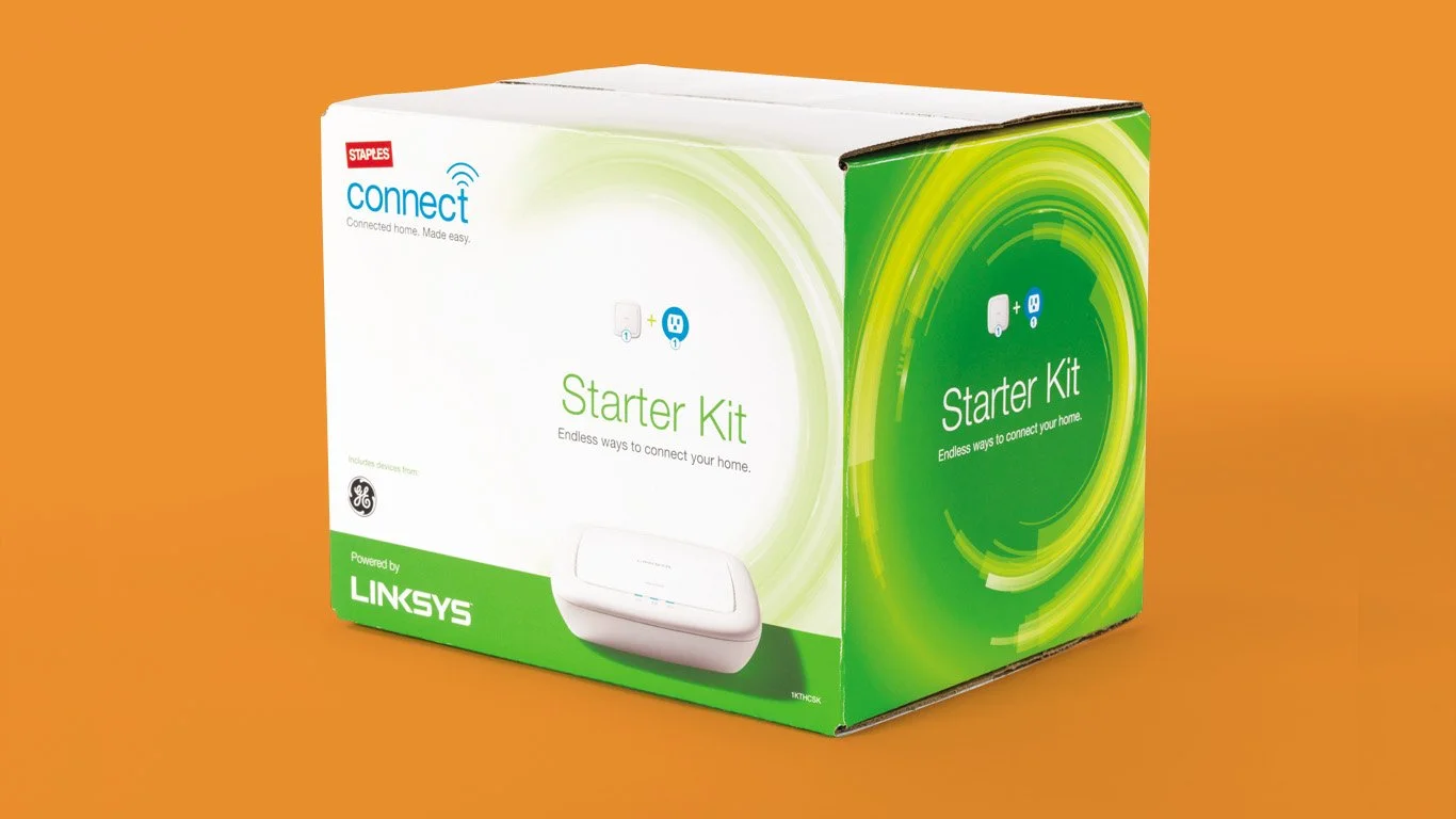
Staples Connect solved this problem by acting as an interpreter between products of any brand, enabling people to build their own unique network of connected devices.
Staples synced up with Ora to create a product brand for their network-expanding devices.
Design Rationale
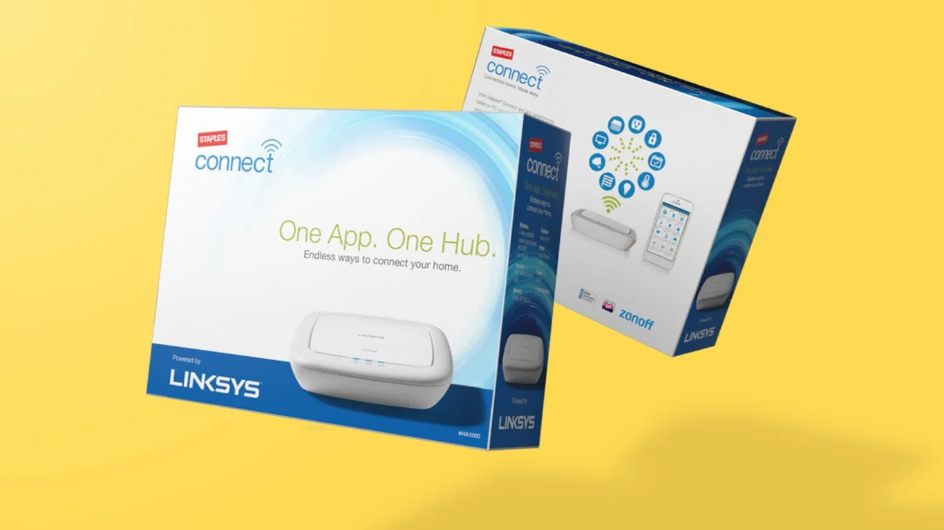
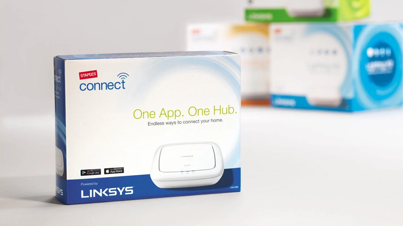
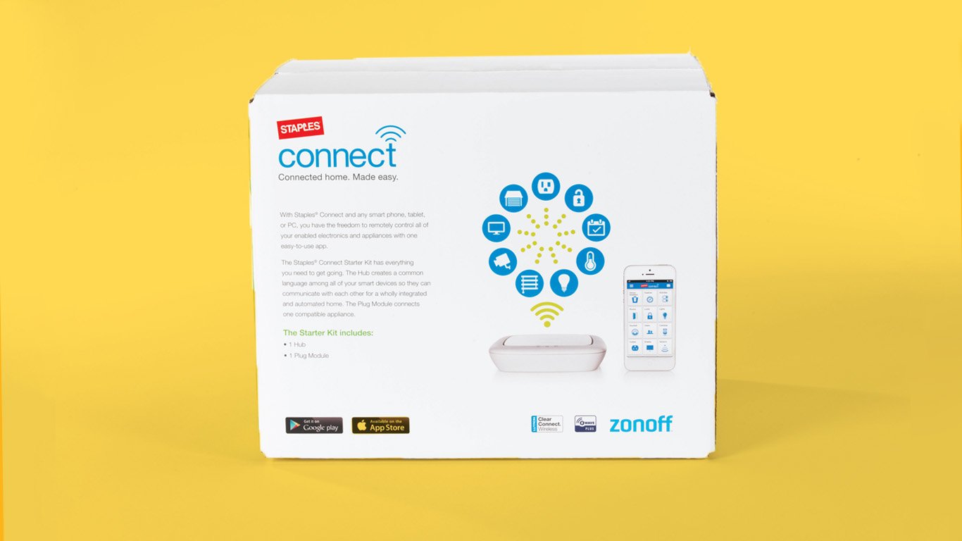
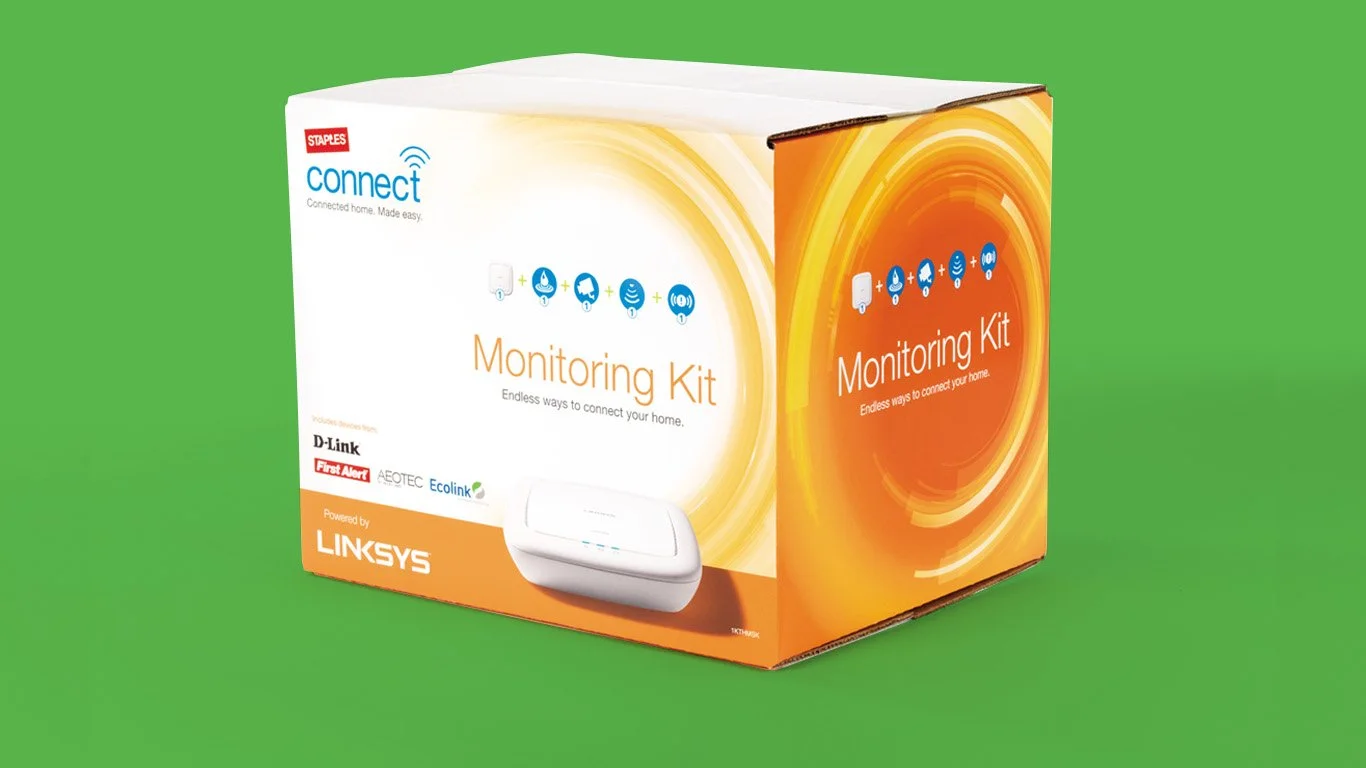
The Staples Connect brand was designed to capture the sense of excitement its target audience felt about the potential of home automation. The tag-line “Connected home. Made easy.” embodied Staples’ value proposition. Bright, bold colors stood out on crowded, often poorly lit, store shelves. The energy ring provided a strong unifying element across the brand while a suite of icons helped clarify the function of each individual product.

The tagline graphic for Staples Connect was used on packaging and in digital marketing.
The brand system Ora created for Staples consists of:
Logo + Tag-line
Package Design
Brand guide with color palette, graphics, & photo direction